Keyword graphs for SEO: from similarity to content architecture
Keyword graphs can reveal relationships that flat lists and rigid clusters hide. But similarity is not knowledge, and neither tells you automatically which queries belong on the same URL. This methodology explains how to build, interpret and validate graph-based topic analysis for SEO.

Farky Rafiq
Founder of ClusterIQ
You have a spreadsheet of 1,500 keywords and need to turn it into a sensible website plan. Which searches belong on the same page? Which need separate answers? And which topics should connect through a wider group of pages? The list tells you what people search for, but it does not make those relationships clear.
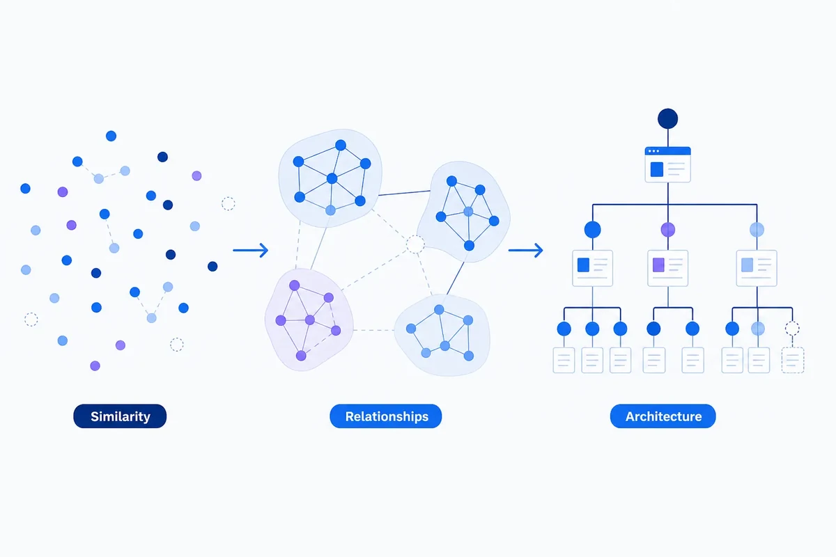
A keyword graph gives you another way to explore the list. By showing connections between searches, it may reveal tightly related groups, terms that link different topics, outliers and alternative ways to organise the same keywords. That can be useful when deciding how to structure your content.
There is an important catch: a graph does not automatically turn keywords into knowledge. Similarity tells you that two terms are related according to a particular model. A graph shows how those relationships fit together. Knowledge, as we use the word here, needs more explicit foundations: identifiable entities, defined relationships, and provenance or validation. Provenance means a record of where an assertion came from. SEO architecture then needs another judgement: should related queries share a page, have separate pages or sit within a connected content system?
That distinction matters because a convincing-looking graph can still rest on weak assumptions. It may look scientific while reflecting the limitations of the data, the model and the threshold used to decide which terms connect.
What a keyword graph represents
In a basic keyword graph, each query is a node, usually shown as a dot. An edge, usually shown as a line, connects two nodes when they meet a defined condition. That condition could be similarity measured by a language model, shared words, overlapping search results, observed user behaviour or a combination of signals.
Edges can also have weights to show the strength of a connection. A weight might represent how similar two queries are in meaning, the proportion of search results they share or how often two terms appear together. A graph can be directed if a relationship has a direction, or undirected if the connection is treated as symmetrical.
These choices are not just technical details to explain after the work is done. They determine what you can read from the graph.
- Embedding graph: queries connect because a language model places their numerical representations, called vectors, close together.
- SERP graph: queries connect because they return similar search engine results pages under particular collection conditions.
- Lexical graph: queries connect because they share words, word stems or entities.
- Behavioural graph: queries connect through observed user activity, such as a sequence of searches or clicks.
- Multilayer graph: several types of relationship are kept separate rather than combined into one score.
You could put the same 1,500 keywords into each of these graphs and get different relationships. An embedding graph may capture similarities in language. A SERP graph captures similarities in the results observed. A behavioural graph captures activity within a particular dataset. None is a universal map of what searches mean.
At Plus IQ, we treat semantic similarity as a useful signal, not proof that two queries have identical intent or should share a URL.
What graphs reveal that lists can hide
A spreadsheet encourages you to work through keywords row by row. Clustering adds groups, but many clustering methods still create a single partition: each keyword goes into one cluster, even if it has meaningful connections to several groups.
A graph can keep more of those connections visible, as long as you interpret its edges and layout carefully. Imagine these six queries appearing within a larger luggage keyword list. This is an illustrative example, not an observed dataset:
- carry-on luggage
- best cabin suitcase
- airline cabin bag size
- lightweight cabin luggage
- under-seat cabin bag
- large checked suitcase
Several relationships overlap here. “Carry-on luggage” and “best cabin suitcase” may be close in both language and commercial purpose. “Airline cabin bag size” concerns the same broad product category, but may need an informational answer. “Under-seat cabin bag” could connect cabin luggage with airline restrictions. “Lightweight cabin luggage” connects a product feature to the wider cabin-bag category.
A graph can show these connections without insisting that every query belongs in one definitive bucket. That helps you ask:
- Which terms are central to the subject?
- Which terms connect different subtopics?
- Which queries sit apart because they express a different need?
- Which groups stay consistent when we change how the graph is built?
- Do the apparent clusters help with page planning, or do they only make sense within the chosen mathematical model?
The graph helps you examine relationships and uncertainty. It does not generate a reliable site architecture automatically.
Similarity is not search intent
Embedding methods turn words, sentences or queries into numerical vectors. A measure such as cosine similarity then compares the direction of two vectors. This is useful because queries with related language or meaning may sit close together in that representation.
However, the representation comes from a particular model and the data used to train it. It captures patterns that system has learned. It is not an objective classification of search behaviour.
Two queries can be close in meaning but still differ in ways that matter for SEO:
- they may come from different audiences;
- the users may be at different stages of their journey;
- one may seek a product while the other seeks a definition;
- they may need different answer formats;
- they may imply different locations, restrictions or commercial actions.
Take “best cabin suitcase” and “airline cabin bag size”. Both concern the same broad subject, but they may deserve different page types. The first may need product comparisons and help with buying. The second may need a concise reference answer, airline-specific details and regular updates.
A high similarity score therefore does not establish that two searches have the same intent, should use the same URL or belong in the same content brief.
SERP overlap answers a different question
SERP overlap is often considered alongside semantic similarity. If two queries return many of the same pages, that may indicate that search engines are responding to them with similar sets of results.
But this is still an observation made under specific collection conditions. Results can change with location, device, date, search features and personalisation. Ranking systems, site authority and competitor behaviour can also affect the overlap.
Shared results do not, on their own, establish identical user intent. They may reflect a common need, but they may also reflect a limited set of pages that currently dominate both searches.
There is also a risk of circular reasoning. If you build a graph entirely from current SERPs, it may reproduce existing competitors’ structures and assumptions. That can help you understand current search conventions. It may be less helpful when looking for unmet demand or exploring a different way to organise information.
Treat semantic similarity and SERP overlap as different layers of evidence. Combining them may help, but doing so too early can hide the difference between what the language suggests and what the current results show.
When does a keyword graph become a knowledge graph?
“Knowledge graph” is used in different ways. Here, it means a graph that represents entities and named types of relationship in a form that can be queried, validated or used for reasoning. That is a working definition for this article, not a claim that everyone in the field agrees on one meaning.
A basic similarity graph does less than this. An edge might mean only that two queries exceed a chosen cosine-similarity threshold. That can be useful, but it is different from making a specific statement about how two things relate.
For example:
- Similarity edge: “carry-on luggage” is related to “under-seat cabin bag”.
- Typed relationship: “under-seat cabin bag” is a type of “cabin luggage” and is constrained by an airline’s under-seat dimensions.
The second version says more. It identifies concepts, names the relationships between them and can record the source of those assertions. In RDF-style representations, these statements are commonly expressed as subject–predicate–object triples: the thing being described, its relationship and the thing it relates to. RDF is an established way to represent this data, but not every knowledge graph has to use it.
A keyword similarity graph could form one layer of a broader knowledge system. To justify that description, the system would need more than nearby query vectors. It would need explicit entities, typed relationships, provenance and some way to validate the assertions.
Calling every keyword network a knowledge graph blurs this distinction and can encourage claims that go beyond what the analysis has actually shown.
Clustering does not solve the interpretation problem
Once you have built a graph, community-detection algorithms can find groups of densely connected nodes. Louvain is a commonly used heuristic, a practical search method, associated with modularity optimisation. Modularity assesses how strongly connections concentrate within groups rather than between them, relative to a comparison model.
This can be computationally practical for large graphs. It does not make the resulting communities the right topics for SEO.
Modularity has known limitations. One is a resolution limit, which can cause smaller communities to be merged into larger ones. Different algorithms, settings and ways of building the graph can produce different groupings. There is no single community structure that is objectively correct for every graph.
A high modularity score tells you something about the graph’s mathematical structure. It does not tell you whether a group would make a sensible page, a useful content brief or a coherent answer to a user need.
Dividing everything into separate groups may also be the wrong approach. A query can relate to a product category, an audience, a use case and a journey stage at the same time. Giving it one cluster makes the spreadsheet tidier, but may remove connections you need for architecture decisions.
The visualisation brings another risk. Layout algorithms place connected nodes near one another. That can make a group look natural even when the rule used to connect those nodes is weak. Their closeness on screen is not independent evidence that they belong together.
A more defensible workflow
If you use graphs to support SEO decisions, make the assumptions visible from the start. This applies whether you are reviewing a few hundred keywords or several thousand.
1. Define the node
Decide what each node represents: an exact query, a normalised query with standardised formatting, an entity, a URL, a document or something else. Mixing these levels without explaining the differences makes the graph ambiguous.
2. Define each edge
Record precisely what each connection means. “Similar” is not enough. Does the edge represent language similarity, shared search results, shared words, entities appearing together or observed user behaviour?
3. Preserve the inputs
Keep the raw scores, collection dates, model details, thresholds and filtering decisions. If you cannot reconstruct a graph, it is difficult to audit it or compare it fairly with another version.
4. Compare methods
When an important decision depends on the output, try more than one reasonable way to build the graph. Compare embedding relationships with SERP overlap or lexical relationships rather than treating one signal as the authority.
5. Test stability
Check what changes when you adjust the model, the nearest-neighbour setting that controls nearby connections, the similarity threshold, geography, device or SERP collection date. Put less confidence in a community that disappears after a small methodological change.
6. Validate against the decision
Review the output against a specific page-grouping question. Should these two queries be served by the same URL, separate URLs within one content system or entirely different sections?
Human reviewers should consider whether the queries share an underlying need, audience, task, entity, answer format, page type and commercial action. This is a recommended way of working, not a universally validated procedure. It does not replace quantitative analysis. It provides the interpretation needed to connect the graph with a practical architecture decision.
Keep relationship layers visible
One practical option is to keep a multilayer graph. One layer can show semantic similarity, another SERP overlap, another lexical or entity relationships, and another behavioural connections where suitable data is available.
Keeping these layers separate can make disagreements useful. If two queries are close in meaning but share few search results, that difference may deserve a closer look. If they share results but use very different language, the connection may come from a recognised product category or the current competitive landscape.
There is a cost, though. Multilayer analysis takes more data, processing and interpretation. Behavioural data can be sparse, biased or restricted by privacy considerations. It should not automatically be treated as better evidence than language or SERP data.
A cautious approach is to keep layers separate when they help explain a decision, and combine them only for a clear reason. The evidence reviewed here does not establish that multilayer analysis consistently improves decisions. That still needs to be tested.
What the graph can and cannot support
A well-defined graph may help an SEO team:
- find connections that are hard to spot in a large keyword list;
- identify possible parent topics and supporting subjects;
- spot outliers that need a separate review;
- see competing ways to draw cluster boundaries;
- explain the reasoning behind a page-grouping recommendation;
- focus human review on uncertain or high-impact areas.
On its own, it cannot:
- prove that two queries have identical search intent;
- prove that they should share a URL;
- establish topical authority;
- guarantee better rankings or less keyword cannibalisation;
- show that a cluster reflects an underlying real-world entity structure;
- replace editorial judgement about usefulness and audience needs.
The evidence supplied for this article does not provide strong general support for the claim that graph-based keyword analysis improves rankings or produces better architecture than conventional clustering. That does not mean graphs cannot help. It means their practical benefit remains something to test, not an established outcome.
The next useful experiment
The most useful test is not whether a graph looks convincing. It is which relationship signal best predicts a page-grouping decision.
A Plus IQ experiment could build a labelled dataset across several domains, with experienced reviewers judging whether pairs of queries should share a URL. The analysis could then compare lexical similarity, embedding similarity, SERP overlap, entity overlap, behavioural connections and combinations of these signals.
Useful measures could include pairwise precision and recall: how often recommended query pairings are correct, and how many of the appropriate pairings the method finds. Other measures could include agreement between reviewers, cluster stability, time spent on manual corrections and the proportion of recommendations that survive editorial review. Rankings or conversions could be examined later, but they introduce additional variables and should not be treated as a direct test of the graph’s validity.
Evaluate the graph against the decision it is meant to support. An elegant mathematical result is not enough.
Conclusion: make relationships explicit
Keyword graphs offer a useful change of perspective. They can show how terms connect, where groups overlap and which parts of a dataset remain uncertain. That gives you more to work with than isolated spreadsheet rows or a single cluster assignment for every keyword.
The key is to distinguish similarity, graph structure and knowledge. A similarity score depends on a model. A graph organises those scores into connections. Knowledge needs explicit entities, typed relationships and validation or provenance. Content architecture needs a further judgement about users, tasks, pages and business purpose.
For SEO, use the graph to support decisions rather than make them for you. Define the nodes and edges, keep different signals visible where useful, test stability and review the output against the page decision. The most credible graph is not the one with the neatest groups. It is the one that makes both the relationships and the uncertainty easier to examine.
Farky Rafiq
Founder of ClusterIQ
I've worked in digital marketing since 2005 and founded Liquid Silver in 2011. These articles are where I share the methods, experiments and practical SEO thinking behind ClusterIQ.
Put the idea into practice with your own keyword data
ClusterIQ helps turn raw SEO exports into clean, structured working datasets you can inspect, refine, report on and take into the next stage of your workflow.
Keep reading
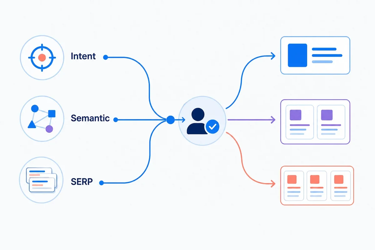
How to combine search intent, semantic similarity and SERP overlap for keyword clustering