UMAP for SEO: visualising keyword embeddings without mistaking the map for the data
UMAP makes high-dimensional keyword embeddings visible, but its two-dimensional map is a projection. Learn how its parameters change the picture and how to use it safely.

Farky Rafiq
Founder of ClusterIQ
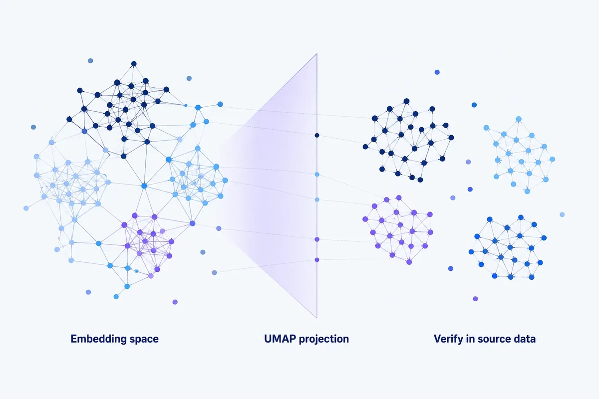
If you have 2,000 keywords in a spreadsheet, spotting related topics, unusual queries and possible gaps can take a lot of scrolling. A visual map can help you see patterns that are difficult to pick out row by row. UMAP is one way to create that map from keyword embeddings, the numerical representations a semantic model uses to capture meaning.
Each embedding may contain hundreds of numerical dimensions, which are difficult to inspect directly. UMAP reduces those vectors to two or three dimensions so you can explore the dataset visually.
The risk comes when you treat the picture as the data itself. A two-dimensional UMAP plot is a transformed view designed to preserve aspects of neighbourhood structure, meaning which points are close to one another. The algorithm and its settings affect the distances, gaps and apparent islands on screen. It is not a literal map of semantic relationships.
What UMAP is doing
UMAP stands for Uniform Manifold Approximation and Projection. Its original paper describes it as a manifold-learning technique for dimensionality reduction. That means it looks for underlying structure in data with many dimensions and creates a representation with fewer dimensions, either for visualisation or for further analysis.
In a keyword-clustering workflow, the starting point might be a matrix of semantic embeddings: one numerical vector for each query. UMAP builds a lower-dimensional version intended to preserve important relationships from that original space.
This can make a dataset of a few thousand queries much easier to inspect. You may be able to see dense topic areas, isolated points and connections between broader subjects that a spreadsheet does not readily reveal.
Why the visualisation is useful for SEO
A useful UMAP view helps you decide where to look more closely. It does not need to give you a ready-made content plan to earn its place in your workflow.
For example, you might notice:
- a large keyword cluster that seems to contain several smaller topic groups;
- an isolated set of queries that could point to a missing topic;
- queries that appear to connect two otherwise separate groups;
- outliers that could be irrelevant or have been standardised incorrectly during data preparation;
- queries with very different wording appearing close together.
Each of these is a reason to investigate, not a conclusion to accept automatically. The chart tells you where to check the keywords and their relationships.
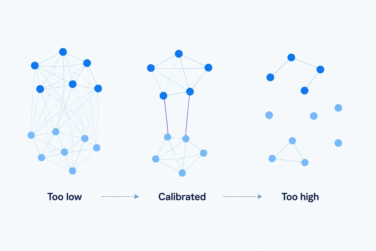
n_neighbors changes the local-global balance
One of UMAP's key settings is n_neighbors. It controls how broadly each point considers its neighbourhood. The current UMAP documentation describes smaller values as preserving more local detail, while larger values produce a more global view of the underlying structure.
For keyword data, this means you can start with exactly the same embeddings and get plots with noticeably different apparent structures.
A small value may highlight tightly related groups, such as different types of running shoes, but make the overall picture look fragmented. A larger value may make broader topic areas easier to recognise while smoothing over those smaller distinctions.
There is no neutral default view. This setting is part of how you interpret the map, not just a technical detail to leave out of the discussion.
min_dist changes how tightly points appear packed
The min_dist parameter controls how closely points can be packed in the lower-dimensional representation. UMAP's documentation notes that smaller values tend to create compact, clumped groups, while larger values spread points more evenly.
That makes a visible difference. A low min_dist can make clusters look sharply defined even when the boundaries in the original, higher-dimensional data are less dramatic.
This does not make the plot inherently misleading. It means the layout is partly a result of the projection. A wide gap between two coloured groups is not, by itself, evidence that their separation is certain.
The distance metric is another modelling choice
Before UMAP can decide which keywords are neighbours, it needs a way to measure distance between their embeddings. It supports several distance metrics in the original high-dimensional space, including Euclidean, cosine and correlation-based measures.
If you normally compare your keyword embeddings using cosine similarity, choosing a different UMAP input metric changes the neighbourhood relationships the projection starts from.
As we explain in our cosine-similarity discussion, the useful question is what relationship that metric represents for your model and task. The choice matters before anything appears on the chart.
A two-dimensional map cannot preserve everything
Reducing hundreds of dimensions to two means losing information. UMAP tries to retain useful structure, but no display can preserve every original relationship at once.
There are two practical consequences to keep in mind.
First, if two queries look close on screen, check their similarity in the original embedding space before making an important decision. Visual proximity alone is not enough to decide, for example, that they belong on the same page.
Second, do not assume that distant points or groups have no meaningful relationship. The projection can distort distances across the wider map while trying to preserve local neighbourhoods.
Treat the chart as a way to explore the data, rather than an instrument for measuring semantic distance.
Do not draw cluster boundaries by eye
It is tempting to spot a few islands on a UMAP plot, colour them in and call them your keyword clusters.
The problem is that this combines visualisation and clustering into one subjective decision. If you want reproducible results, use an explicit clustering or community-detection method to assign the labels, then display those labels on the UMAP plot.
Keeping those steps separate lets you ask whether the clustering and the visualisation tell a consistent story. Neither has to define the other.
Our comparison of K-means, HDBSCAN and graph clustering explains the different assumptions behind those methods.
Should you cluster the UMAP output?
Sometimes, but it changes what you are clustering.
If you run HDBSCAN on a UMAP-reduced representation, it works with the geometry UMAP has produced, not the original embedding vectors. UMAP's settings therefore become part of the clustering configuration, not just the display settings.
There can be practical reasons to take this route. Reducing the number of dimensions may make patterns of density easier to work with and can lower computational cost. But you need to evaluate the whole sequence of steps, rather than attribute the result to HDBSCAN alone.
Before using this in a production workflow, compare at least two approaches:
- clustering, or finding neighbouring queries, in the original embedding space;
- clustering after a controlled dimensionality-reduction step.
If those approaches produce substantially different topic structures, investigate the reasons. Do not choose a result just because its plot looks cleaner.
Use reproducible settings
UMAP includes random elements, so repeated runs can produce different layouts. Fixing the random state can make the workflow easier to reproduce, although settings that make results deterministic can affect performance.
For every saved analysis, record:
- the embedding model and version;
- the UMAP version;
n_neighbors;min_dist;- the distance metric;
- the number of output dimensions;
- the random state or seed, where used.
A screenshot may be useful in a client presentation, but without these settings it is difficult to audit or recreate the keyword map later.
How to validate what you see
A good review moves between the chart and the original data. Use the picture to find questions, then check whether the keywords and their embeddings support what you think you are seeing.
- Inspect local neighbours. Choose points that look close together. Compare their similarity in the original embedding space and read the queries to check their meaning.
- Inspect apparent boundaries. Read queries on both sides of a visible gap. Check whether there is a meaningful distinction rather than assuming the gap marks a firm category boundary.
- Compare parameter settings. Change
n_neighborsandmin_distto see which structures remain recognisable. - Overlay independent labels. Add intent, category, cluster or page mappings. This helps you check whether the visual pattern corresponds to something useful for your SEO work.
- Review outliers. Check whether isolated points are genuinely unusual queries, errors introduced during data preparation or legitimate niche topics.
UMAP can be valuable even when it does not decide anything
It is easy to judge an analysis tool by whether it gives you a direct action. Visualisation has a different job.
UMAP can help you understand a keyword dataset, explain relationships to colleagues and find cases worth investigating. That is useful even if the projection never directly leads to a new URL.
This fits the broader ClusterIQ approach: advanced methods should make the evidence easier to inspect while leaving the SEO decision with the person responsible for it.
ClusterIQ Conclusion
UMAP makes high-dimensional keyword data visible and easier to explore. It can reveal nearby groups, outliers and broader structures that would be difficult to spot in spreadsheet rows.
But the map is a projection, not the underlying semantic space. Settings such as n_neighbors, min_dist and the distance metric all influence what you see.
Use UMAP to explore and diagnose. Keep the original embeddings available, separate visualisation from clustering, save your configuration and check important relationships before turning a visual pattern into an SEO decision.
Sources and further reading
Farky Rafiq
Founder of ClusterIQ
I've worked in digital marketing since 2005 and founded Liquid Silver in 2011. These articles are where I share the methods, experiments and practical SEO thinking behind ClusterIQ.
Put the idea into practice with your own keyword data
ClusterIQ helps turn raw SEO exports into clean, structured working datasets you can inspect, refine, report on and take into the next stage of your workflow.
Keep reading
Adding new keywords to existing clusters without rebuilding everything
HDBSCAN for keyword clustering: density, noise and uncertain queries