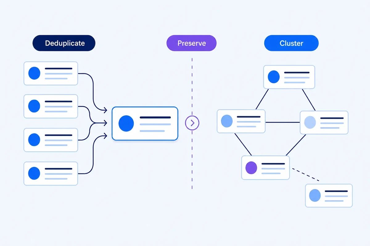
Graph layouts for SEO: why a keyword map can look persuasive and still mislead you
Force-directed keyword maps are useful for exploration, but layout algorithms change how the graph looks. Learn how to separate visual proximity from analytical evidence.

Farky Rafiq
Founder of ClusterIQ
A keyword graph often looks like a finished piece of work long before you have actually interpreted the data. When you see clusters, gaps, and bridges on a screen, it feels intuitive because it mimics a physical map. However, there is a significant risk in assuming that the visual distance between two points is a direct measure of their semantic relationship or SEO value.
In reality, a graph layout is just a presentation algorithm. It is a tool to help you inspect evidence, but the visual arrangement should never be mistaken for the evidence itself.
How graph layouts function
Technically, a graph is just a collection of nodes (keywords) and edges (the relationships between them). It does not naturally have two-dimensional coordinates. To show this on a screen, layout algorithms assign positions to these elements. Common libraries like NetworkX offer various layouts, such as spring, Kamada-Kawai, circular, or spectral, each designed to achieve a different visual goal.
Force-directed layouts and the spring effect
The most common approach is the spring layout. It treats the connections between keywords as attractive forces, while the keywords themselves repel each other. This causes tightly related groups to pull together into visible communities while less related terms drift apart.
While this is great for spotting natural groupings in a set of a few thousand keywords from Ahrefs or Semrush, the exact placement of a node depends on specific settings and random seeds. The position is a suggestion, not a mathematical law.
Distance is not a similarity score
You might see two keywords sitting next to each other on a map even if they have no direct connection, simply because of how the layout settled. Conversely, two keywords with a strong relationship might appear far apart because other forces in the network pulled them in different directions.
When you need to know if two terms belong in the same content brief, ClusterIQ should provide the specific edge weight or shared entities. Relying on pixel distance alone can lead to incorrect assumptions about how topics should be grouped on a URL.
Why the same data can look different
If you run the same keyword set through a layout algorithm twice with a different random seed, the visual arrangement will change even if the data is identical. This can make a topic landscape look like it has shifted when nothing has actually changed in the analysis.
For consistent reporting and page-level decisions, it is vital to save your layout parameters alongside your clustering settings. This ensures your screenshots remain reproducible over time.
A practical example: the dramatic gap
Consider two keyword communities joined by three moderate connections. One layout might place them on opposite sides of the screen with a wide white gap, suggesting they are totally unrelated. Another layout might tuck them close together. The actual data remains the same, but the visual drama changes. This is why ClusterIQ allows you to click into these bridges to see the real relationship strength rather than guessing based on the layout.
Colour should follow the data
Adding colour to a graph is useful for highlighting communities after they have been calculated. However, drawing coloured circles by hand and calling them clusters is working backwards. The analytical grouping must exist before the rendering begins.
As noted in our guide on UMAP for SEO, visualisation is a surface for investigation, not the absolute truth of the data.
Giving nodes and edges explicit meaning
Large nodes naturally draw the eye. If you are looking at a Search Console export, you must decide what that size represents. Is it search volume? Business priority? Or perhaps degree centrality (how well-connected the term is)? Mixing these meanings makes a map look impressive but renders it analytically useless.
The same applies to edge width. A thicker line should represent something specific, like SERP overlap or semantic similarity. Using legends and tooltips ensures that when a junior SEO looks at a map, they understand exactly what the visual variables signify.
Managing scale with progressive disclosure
Dumping 10,000 keywords into a single view is rarely helpful. A more effective interface starts with the big picture and lets you drill down. A useful workflow involves looking at:
- Broad keyword communities;
- Representative "seed" nodes;
- Important bridge terms that link topics;
- Outliers that don't fit the main groups.
This allows you to move from a high-level content plan down to specific keyword clusters without being overwhelmed by noise.
Using layouts to spot review candidates
Visual maps are excellent for identifying things that a spreadsheet might hide, such as:
- Isolated keyword groups that need their own landing pages;
- Long chains of terms that suggest a thin content path;
- Huge hubs that might be too broad for a single URL;
- Clusters with mixed intent that require manual sorting.
These visual cues are your signal to stop looking at the map and start looking at the underlying metrics.
Comparing graphs with stable anchors
When comparing two different keyword exports, try to keep the positions of stable nodes fixed. If every node moves, you won't be able to see the structural changes you actually care about. While side-by-side maps are great for presentations, a data-driven change log is always more reliable for serious SEO audits.
Building trust through transparency
When used correctly, these maps help clients and stakeholders trust the results. It is much easier to explain a content strategy when you can show how ClusterIQ moved from a broad topic to specific clusters and bridge terms. It is far more transparent than handing over a CSV file with arbitrary cluster IDs and no context.
Keep the map optional
Not every SEO professional prefers a visual workflow. A keyword map should support your work alongside tables, filters, and reports. Visualisation is a powerful aid for comprehension, but it should never be the only way to access your data.
Practitioner principle: a graph layout helps you see the network. It does not define the network.
ClusterIQ Conclusion
Graph layouts make complex keyword relationships easier to explore, but we must remember that visual proximity is a result of the rendering algorithm as much as the data itself. By using visualisation to expose structure and uncertainty while keeping the raw evidence accessible, ClusterIQ provides the benefits of a map without the risk of misinterpreting the landscape.
Sources and further reading
Farky Rafiq
Founder of ClusterIQ
I've worked in digital marketing since 2005 and founded Liquid Silver in 2011. These articles are where I share the methods, experiments and practical SEO thinking behind ClusterIQ.
Put the idea into practice with your own keyword data
ClusterIQ helps turn raw SEO exports into clean, structured working datasets you can inspect, refine, report on and take into the next stage of your workflow.
Keep reading
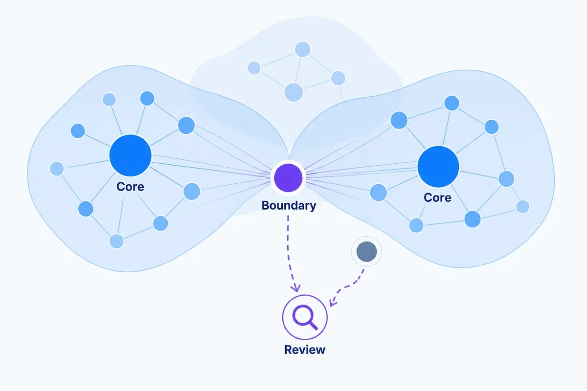
Soft clustering and confidence scores: handling ambiguous keywords honestly
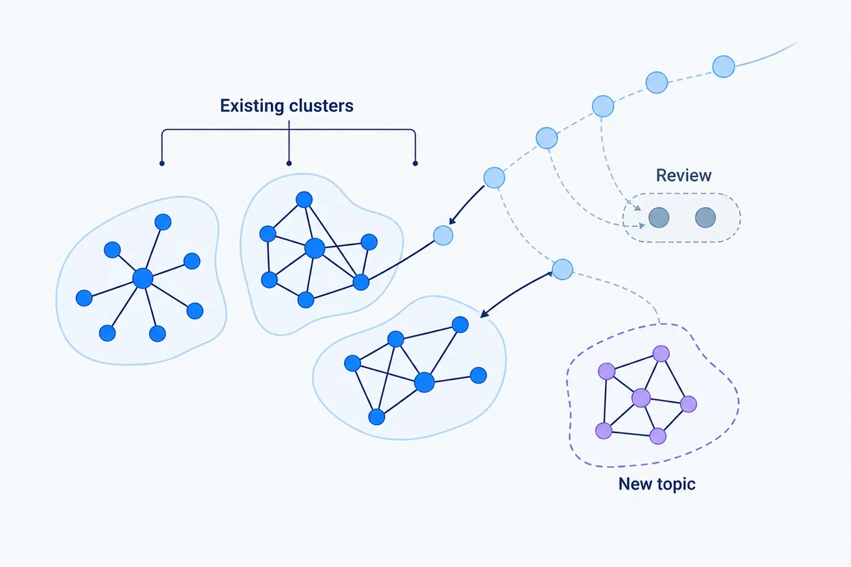
Adding new keywords to existing clusters without rebuilding everything